ES
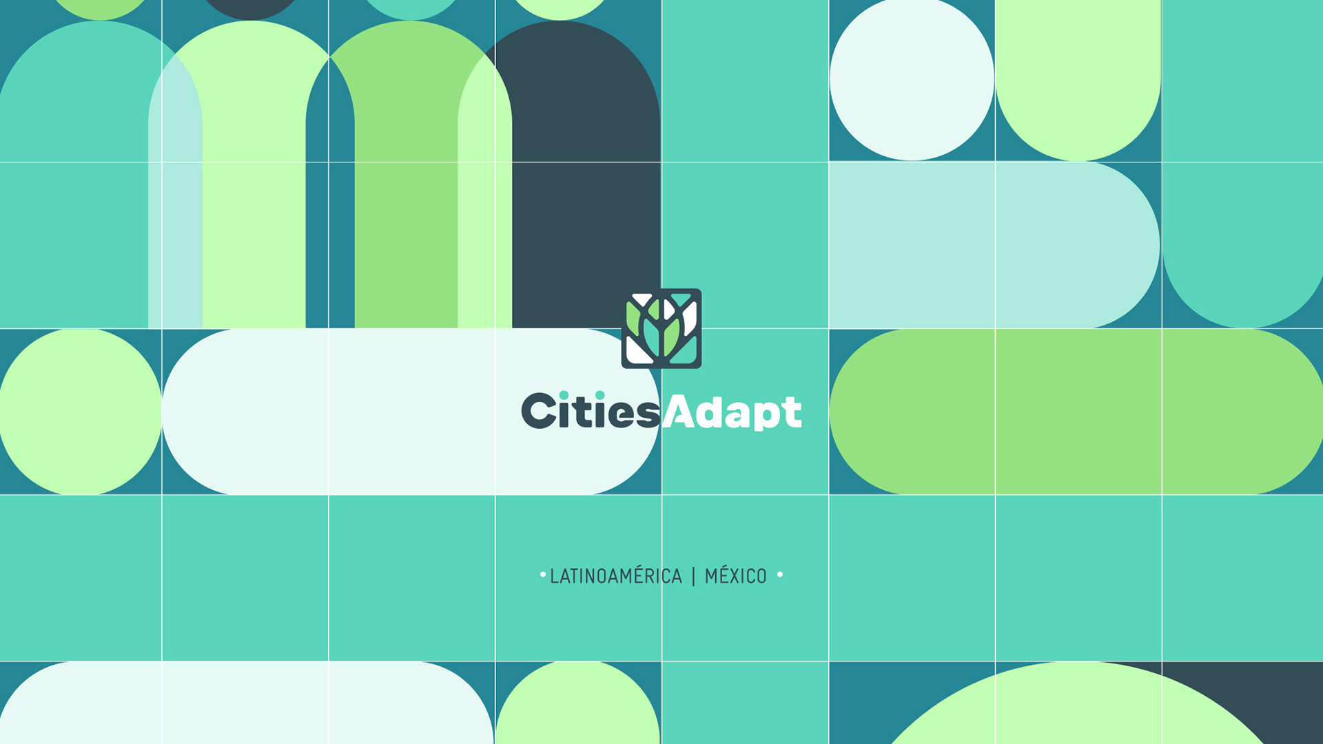
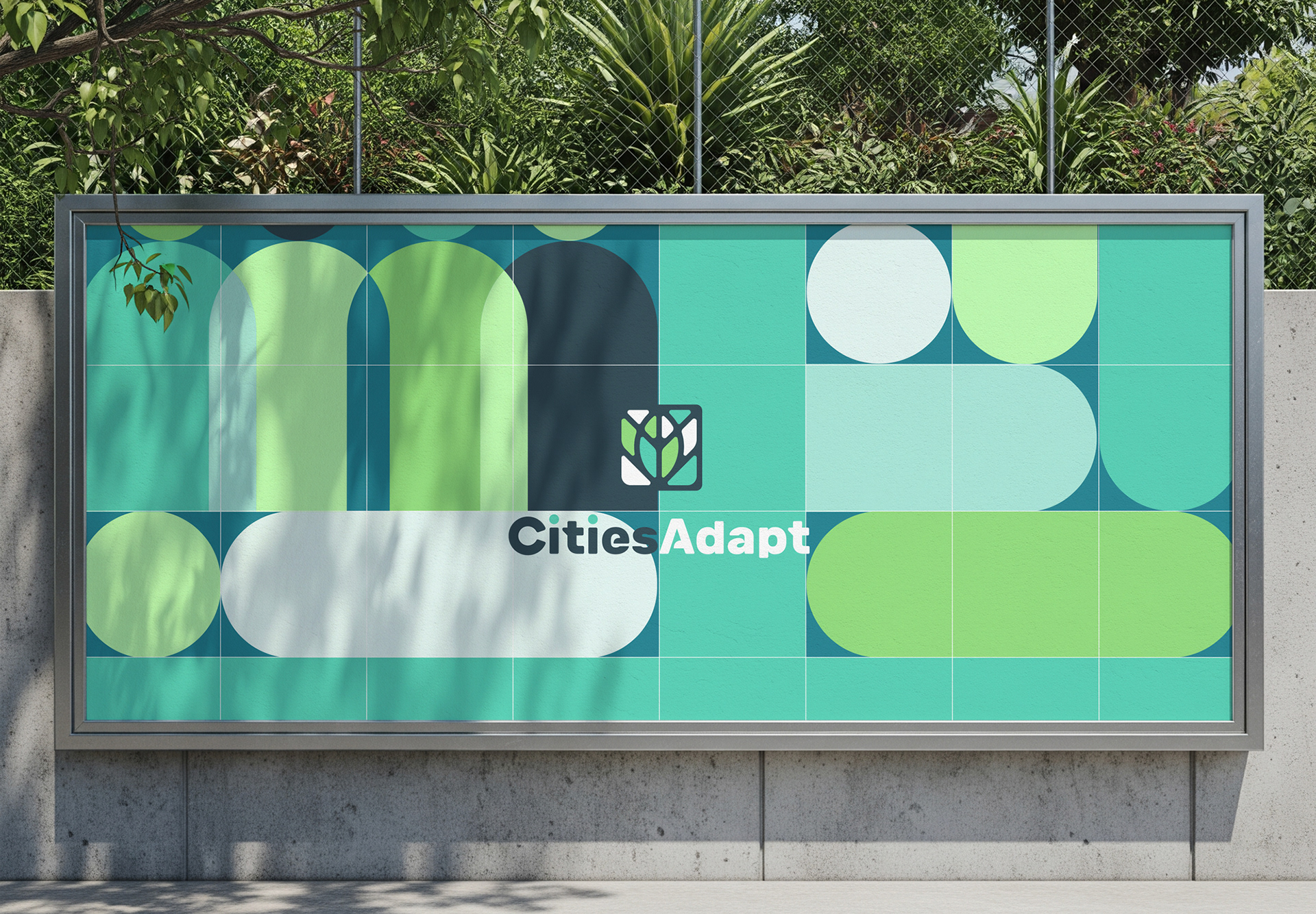
CitiesAdapt es una iniciativa que busca fortalecer la adaptación al cambio climático en las ciudades. Para su implementación en México, desarrollamos una identidad visual que incluye un sistema de ilustraciones y una línea editorial, creando un lenguaje gráfico claro, flexible y cercano para comunicar los objetivos y contenidos del proyecto.
EN
CitiesAdapt is an initiative that seeks to strengthen climate change adaptation in cities. For its implementation in Mexico, we developed a visual identity that includes an illustration system and an editorial approach, creating a clear, flexible, and approachable visual language to communicate the project's objectives and content.
ES
El ícono representa caminos y calles que se adaptan a las vetas de una hoja, simbolizando un proceso de urbanización que dialoga con su entorno y se adapta al medio ambiente.
La forma integra tres conceptos clave: integración, modulación y sustentabilidad.
EN
The icon represents roads and paths adapting to the veins of a leaf, symbolizing an urbanization process that responds to its surroundings and adapts to the environment.
The form brings together three key concepts: integration, modulation, and sustainability.

ES
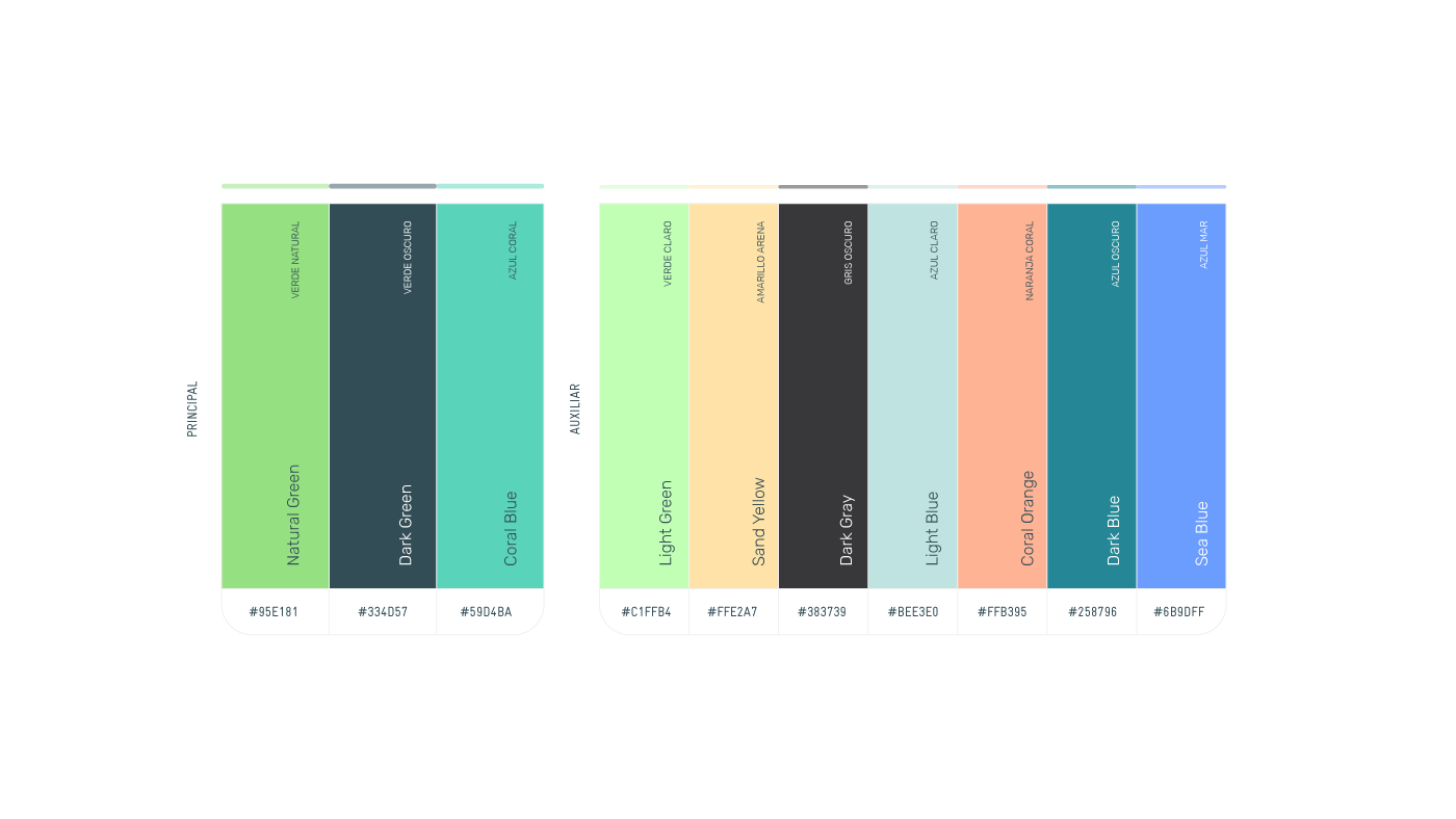
La paleta de color principal está compuesta por Natural Green, Dark Green y Coral Blue, colores que construyen la identidad visual de CitiesAdapt México. Como complemento, la paleta auxiliar incorpora Light Green, Sand Yellow, Dark Gray, Light Blue, Coral Orange, Dark Blue y Sea Blue, pensados principalmente para el desarrollo de ilustraciones y recursos gráficos.
EN
The primary color palette is composed of Natural Green, Dark Green, and Coral Blue, establishing the visual identity of CitiesAdapt Mexico. As a complement, the secondary palette includes Light Green, Sand Yellow, Dark Gray, Light Blue, Coral Orange, Dark Blue, and Sea Blue, primarily intended for illustrations and graphic elements.
ES
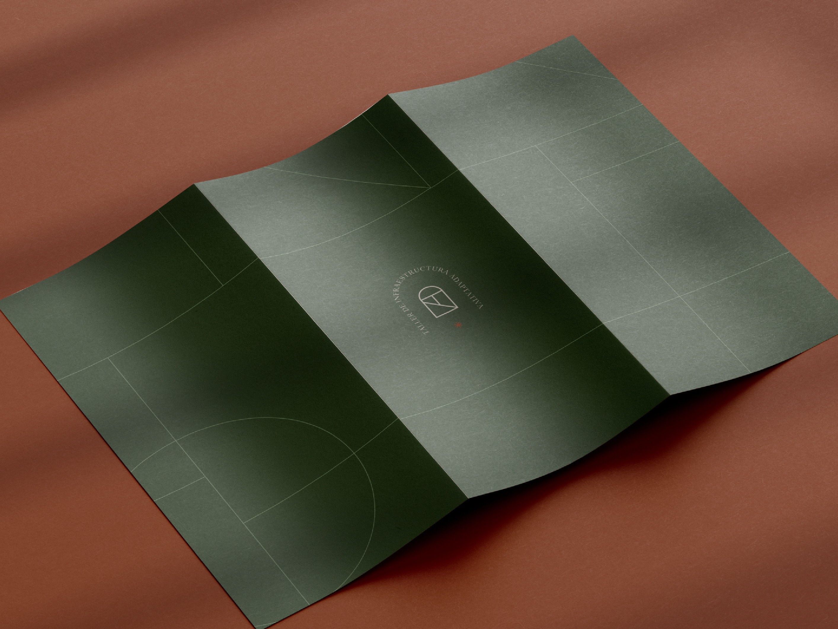
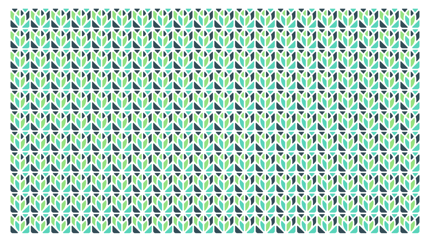
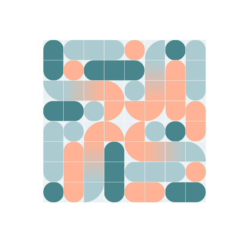
A partir del ícono se desarrolló un patrón gráfico como elemento auxiliar de la identidad. Su repetición y modulación permiten generar diferentes texturas y composiciones, aportando dinamismo y continuidad al sistema visual.
EN
Based on the icon, a graphic pattern was developed as a supporting element of the identity. Its repetition and modulation allow for the creation of different textures and compositions, adding dynamism and continuity to the visual system.
ES
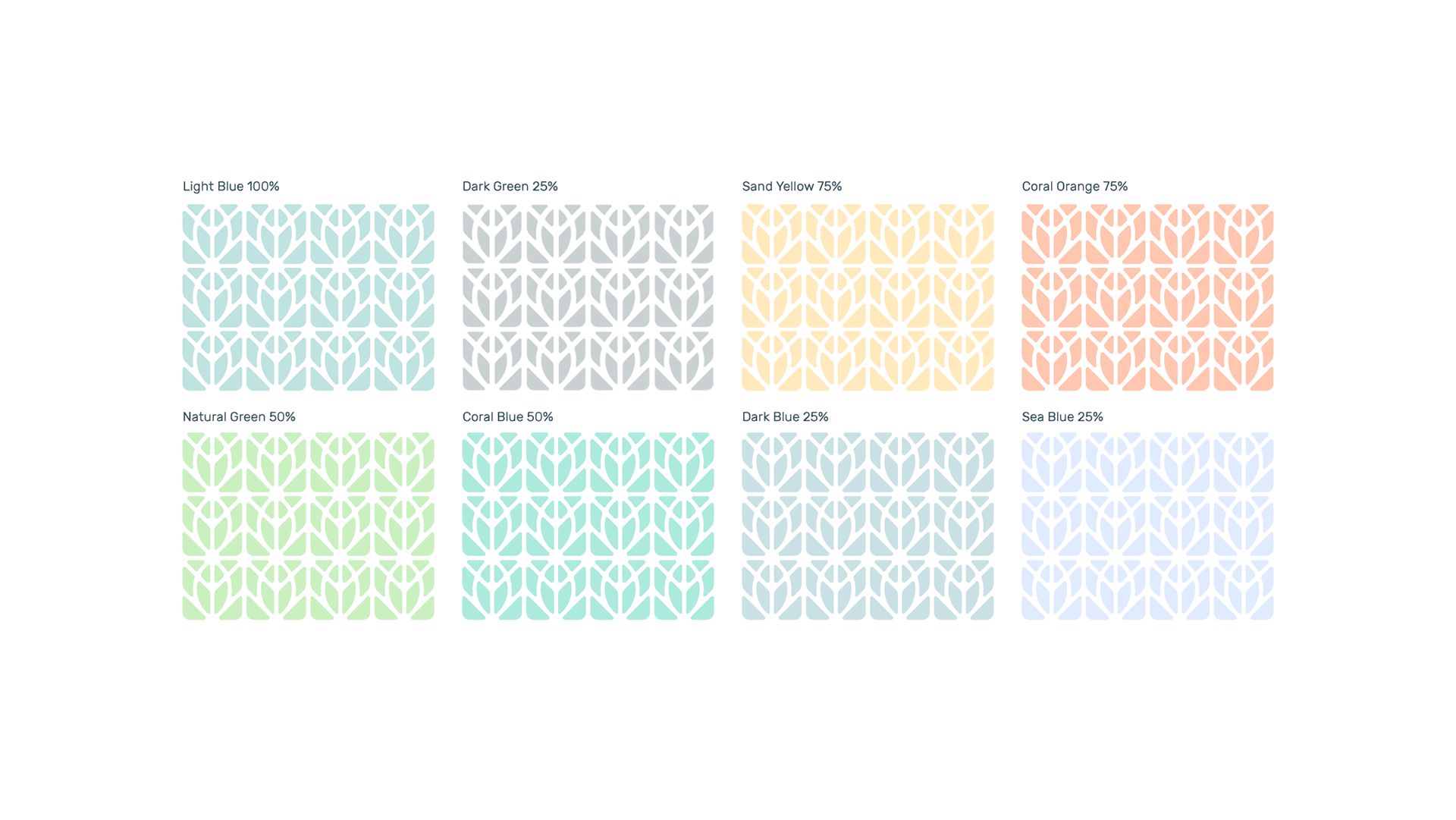
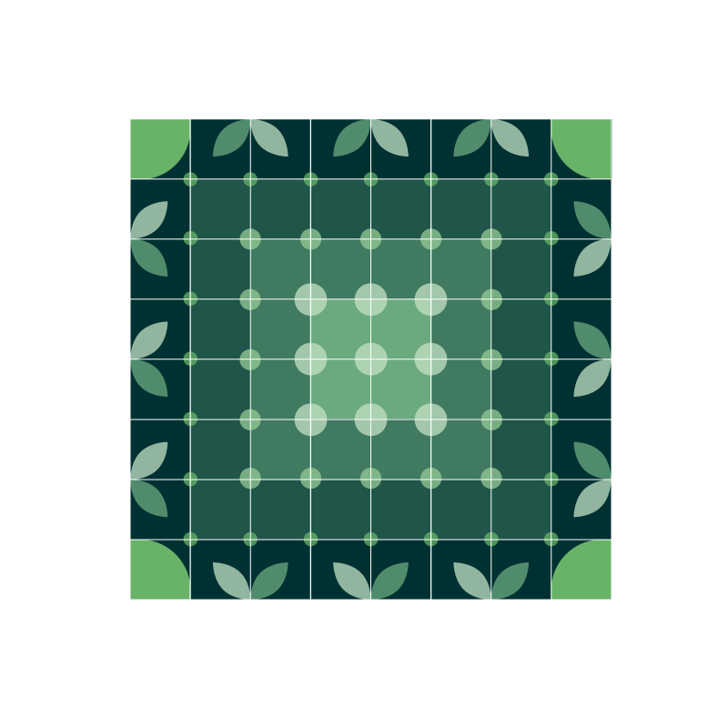
El patrón gráfico puede aplicarse en distintas combinaciones de la paleta de color, permitiendo generar diferentes niveles de contraste y adaptarse a diversos soportes y composiciones sin perder la coherencia de la identidad visual.
EN
The graphic pattern can be applied using different combinations of the color palette, allowing for varying levels of contrast and adapting to different formats and compositions while maintaining the consistency of the visual identity.
ES
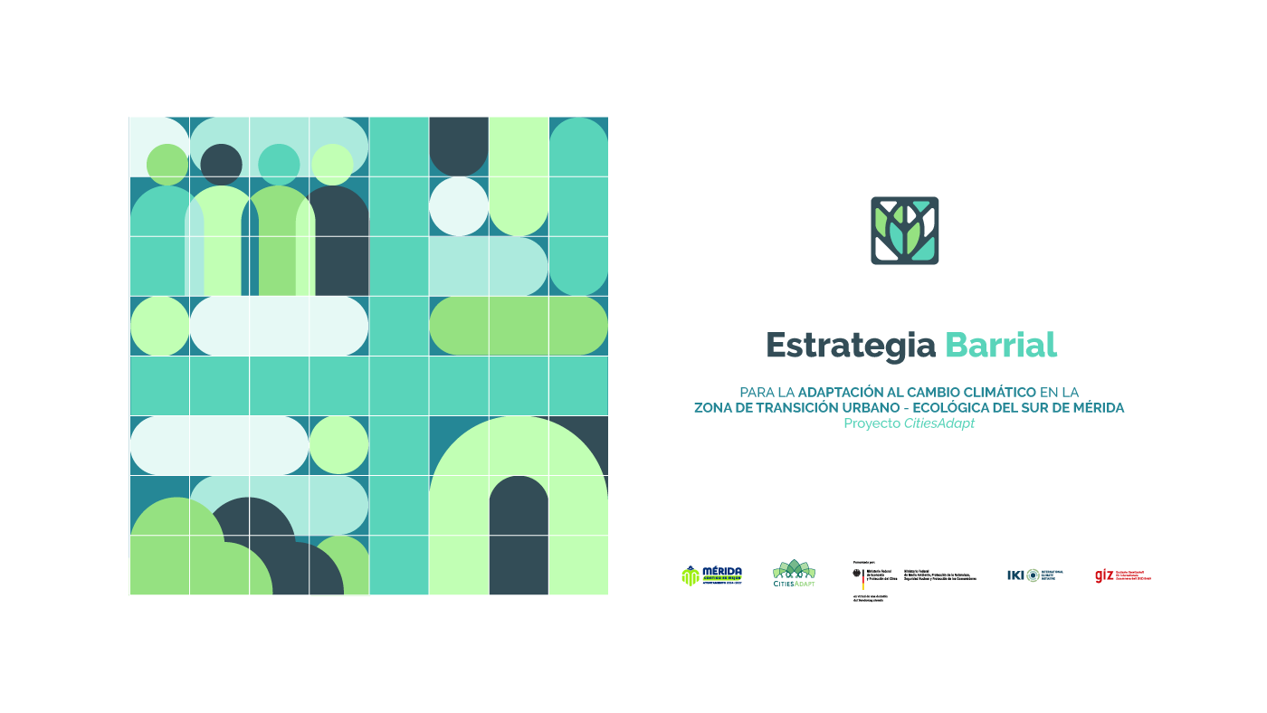
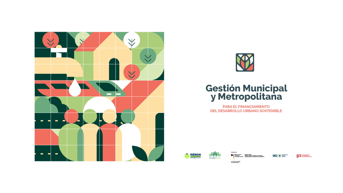
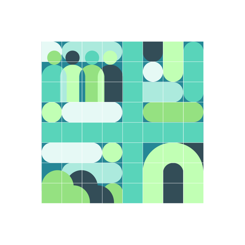
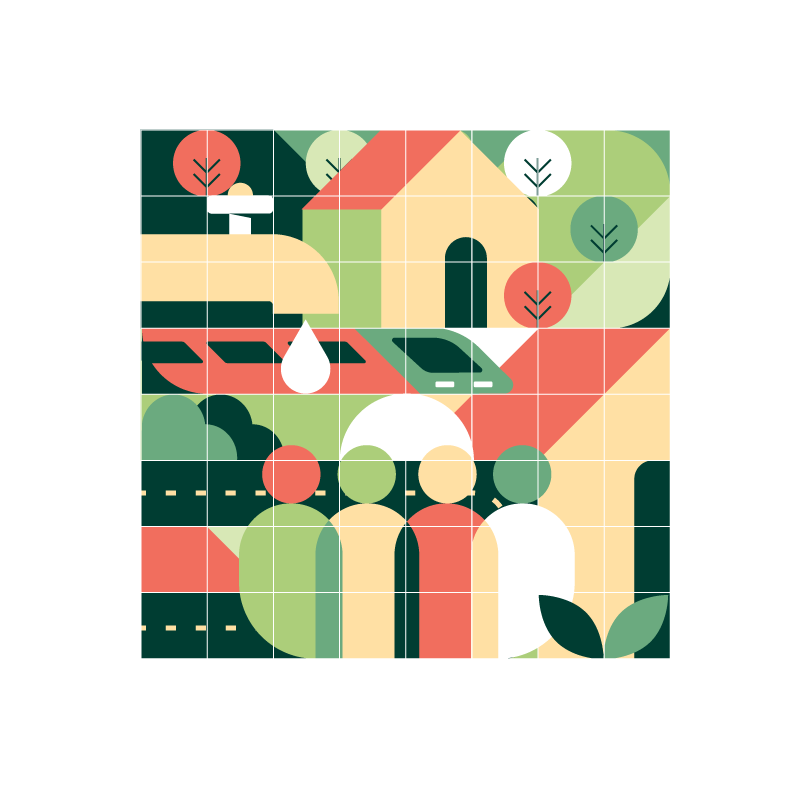
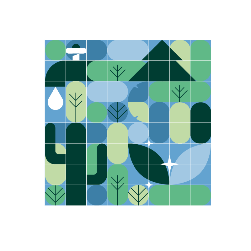
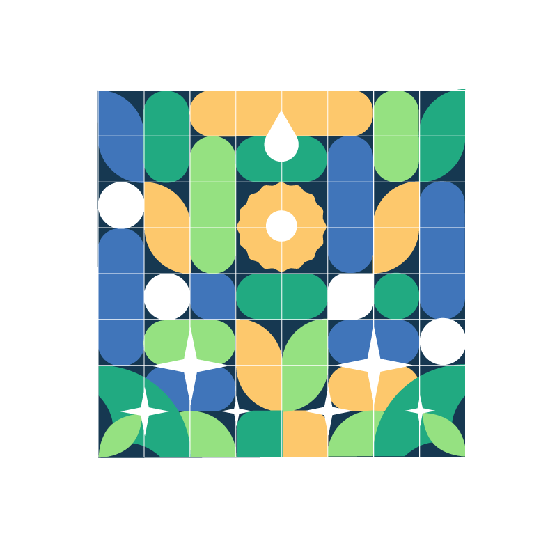
Las ilustraciones se desarrollan a partir de un estilo geométrico, utilizando la paleta de color y una composición dinámica con elementos gráficos relacionados con los temas de CitiesAdapt. Todas se construyen sobre una retícula de 64 cuadrados (8 × 8), definida por un outline blanco visible, donde se organizan y desarrollan los conceptos a comunicar.
Esta estructura permite experimentar libremente con la composición, el movimiento y la combinación de elementos, manteniendo siempre una identidad y un lenguaje gráfico consistentes.
EN
The illustrations are developed through a geometric style, using the color palette and dynamic compositions with graphic elements related to CitiesAdapt’s themes. Each illustration is built on a grid of 64 squares (8 × 8), defined by a visible white outline, where the concepts to be communicated are organized and developed.
This structure allows for creative freedom in composition, movement, and the combination of elements, while maintaining a consistent visual identity and graphic language.
ES
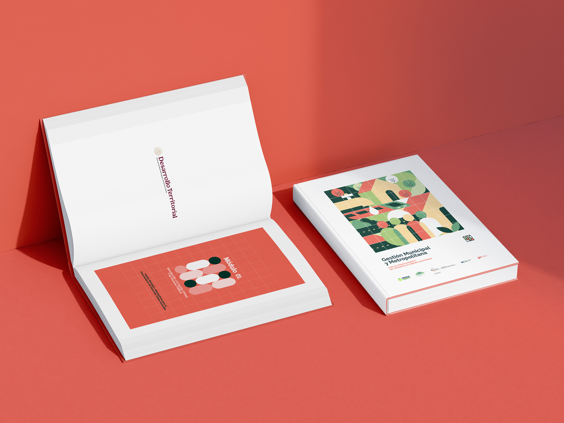
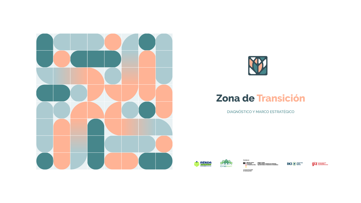
El ícono se mantiene como un elemento constante en cada portada, conservando su forma para reforzar la identidad visual. Su paleta de color, en cambio, se adapta y cambia de acuerdo con el tema y la ilustración de cada portada, generando variedad sin perder coherencia dentro del sistema.
EN
The icon remains a consistent element across every cover, keeping its shape to reinforce the visual identity. Its color palette, however, adapts and changes according to the theme and illustration of each cover, creating variety while maintaining consistency throughout the system.

ES
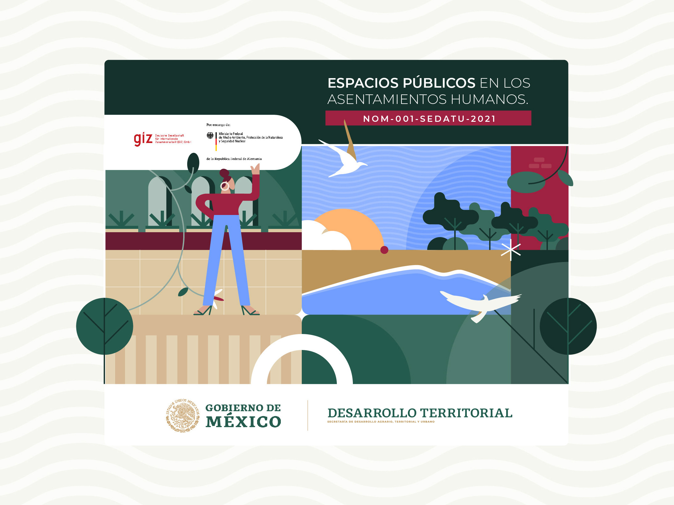
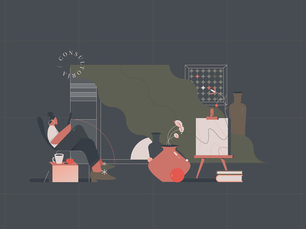
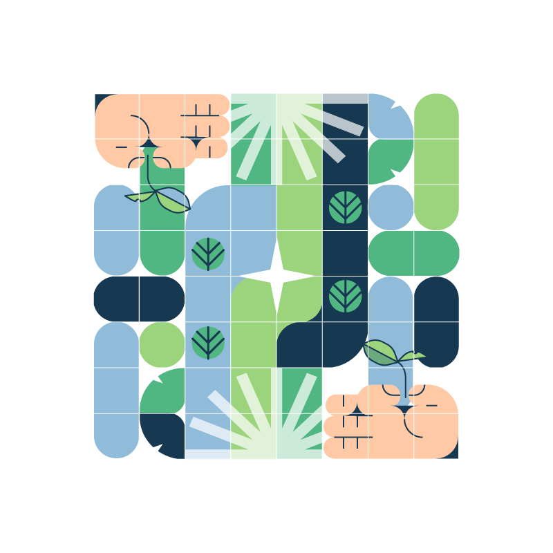
También se desarrollaron distintas ilustraciones para explorar situaciones, conceptos y recursos dentro del mismo lenguaje gráfico. Aquí se muestran algunas de ellas como parte del universo visual de Cities Adapt.
EN
Additional illustrations were developed to explore different situations, concepts, and visual resources within the same graphic language. Here are some of them, as part of the broader visual universe of Cities Adapt.

ES
Este proyecto ha sido posible gracias a la colaboración, el diálogo y el compromiso de quienes creen en la construcción de ciudades más resilientes, inclusivas y preparadas para el futuro. Agradecemos a GIZ México, al Gobierno de México y a SEDATU por impulsar este camino, así como a Gerardo González Alfaro, líder del proyecto, por su acompañamiento, visión y compromiso a lo largo de este proceso. Gracias por hacer posible Cities Adapt y por seguir construyendo, de manera colectiva, nuevas formas de imaginar y transformar nuestras ciudades.
ENG
This project has been made possible through the collaboration, dialogue, and commitment of those who believe in building cities that are more resilient, inclusive, and prepared for the future. We thank GIZ Mexico, the Government of Mexico, and SEDATU for helping drive this journey, as well as Gerardo González Alfaro, Project Lead, for his guidance, vision, and commitment throughout the process. Thank you for making Cities Adapt possible and for continuing to collectively imagine and transform new ways of shaping our cities.